Figma's variables system is useful for design systems, but it's finicky as hell. Here's what actually works and what'll make you want to throw your laptop.
The Four Variable Types (Not Six - That's Bullshit)
Figma supports four variable types, despite what other guides claim:
What Actually Exists:
- Color: For colors (shocking, I know)
- Number: For spacing, opacity, dimensions
- String: For text labels and content
- Boolean: For showing/hiding stuff
What Doesn't Exist (Yet):
- "Composite Variables" - this is made-up marketing bullshit
- "Six core types" - nope, just four
Setting Up Variables Without Losing Your Mind
Variables are great in theory, like communism or using vim. Here's what I learned after setting up variables for design systems and regretting most of my choices:
The Good:
- Theme switching actually works once you get it set up
- Spacing tokens prevent developers from using random values
- Color modes save you from maintaining separate dark/light versions
The Bad:
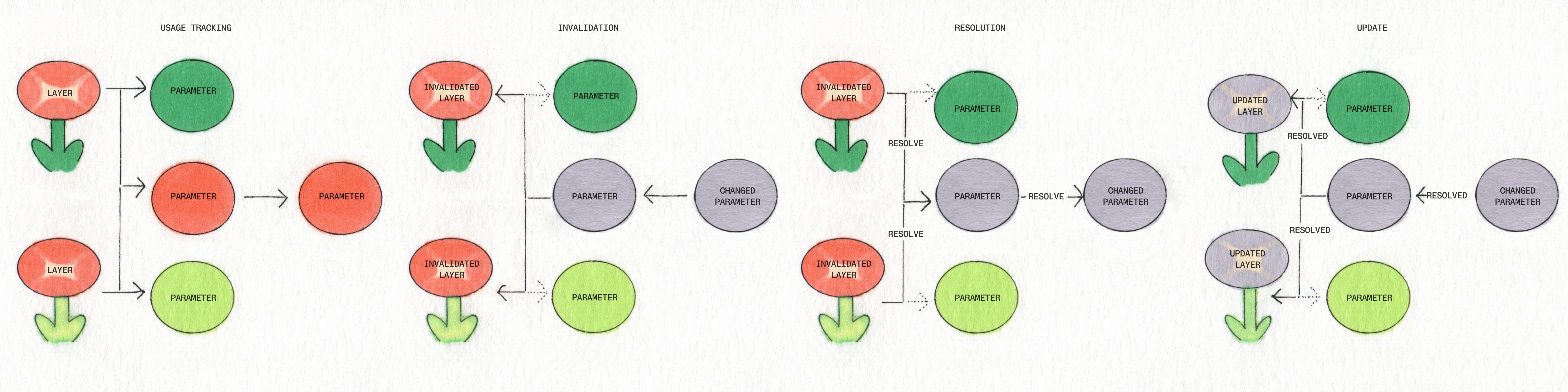
- Renaming variables breaks everything and there's no way to fix them in bulk (learned this when renaming a spacing variable broke a bunch of production components - that was a fun day)
- The variable UI becomes unusable once you have a lot of them (scrolling through hundreds of variables looking for
color-text-secondaryis torture) - Nested references create dependency hell that's impossible to debug (spent way too long trying to figure out why changing one color variable broke button states - turns out variables were daisy-chained together)
Naming Convention That Won't Screw You Over:
Use category-use-variant structure:
color-text-primarynotprimary-text-colorspace-padding-smallnotsmall-paddingsize-icon-mediumnotmedium-icon-size
This matters because Figma's search is terrible, so alphabetical sorting is your lifeline.
Auto Layout: The Good, Bad, and Ugly
Auto Layout is Figma's best feature until you need it to do anything complex. Here's the reality:
Auto Layout Works Great For:
- Simple stacks (buttons, form fields, lists)
- Basic responsive behavior
- Consistent spacing between elements
Auto Layout Breaks Down With:
- Overlapping elements (it just can't handle it)
- Complex card layouts (use absolute positioning instead)
- Anything that needs precise pixel control
Grid Mode: Half-Baked but Getting There
Figma added Grid mode in 2024 and it's... okay. Better than nested Auto Layout hell, but still missing basic features like gap control and proper responsive behavior.
Tricks That Actually Work:
- Negative spacing for overlapping elements (but it's hacky)
- Baseline alignment for text-heavy layouts (when it works)
- Auto Layout + absolute positioning hybrid approach for complex layouts
- Using Figma's responsive settings instead of trying to make everything Auto Layout
When to Give Up on Auto Layout:
If you're fighting it for more than 10 minutes, just use absolute positioning. Your time is worth more than maintaining some purist Auto Layout ideology that exists only in Figma's marketing materials.
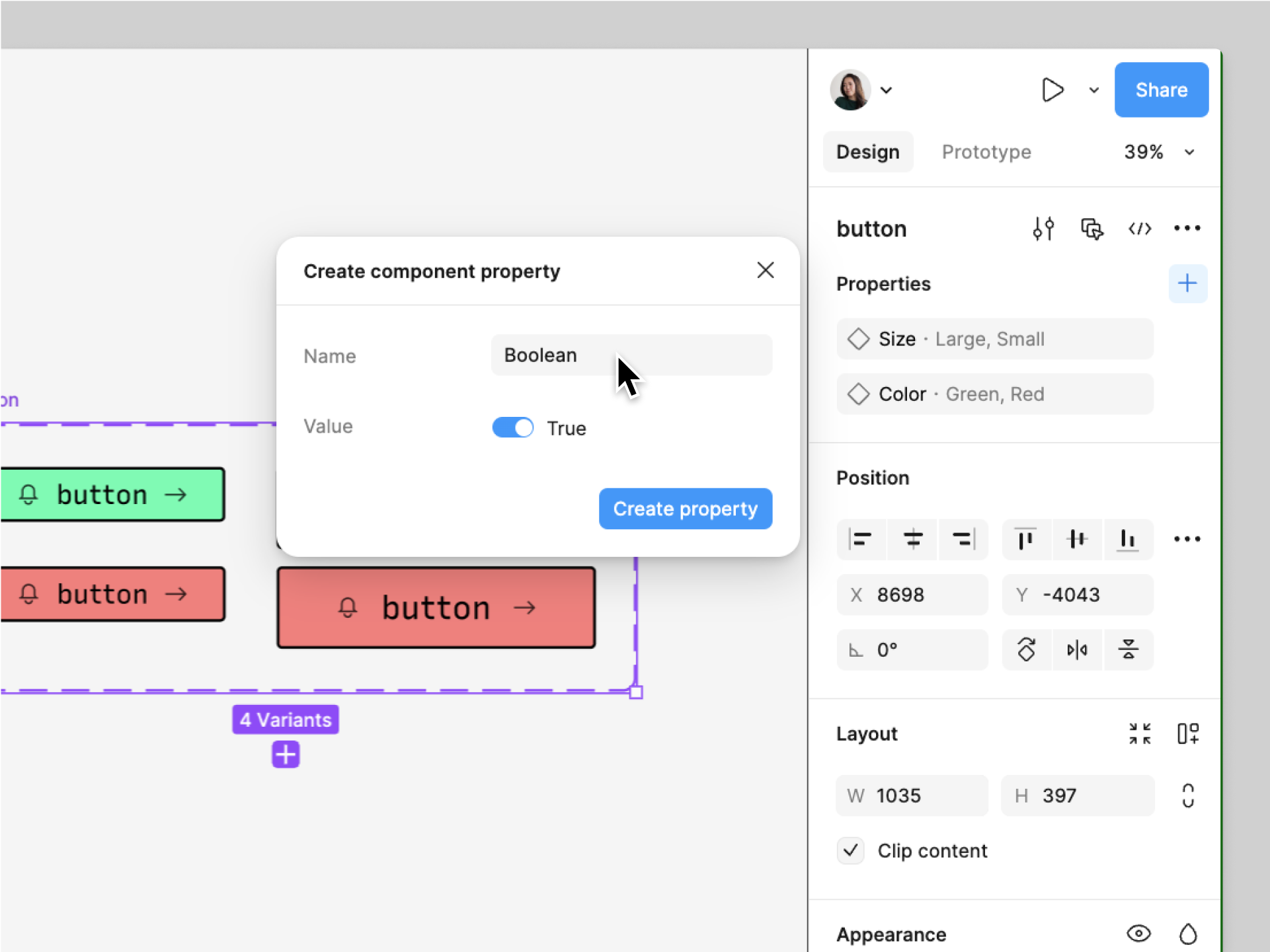
Components: Where Things Get Complicated
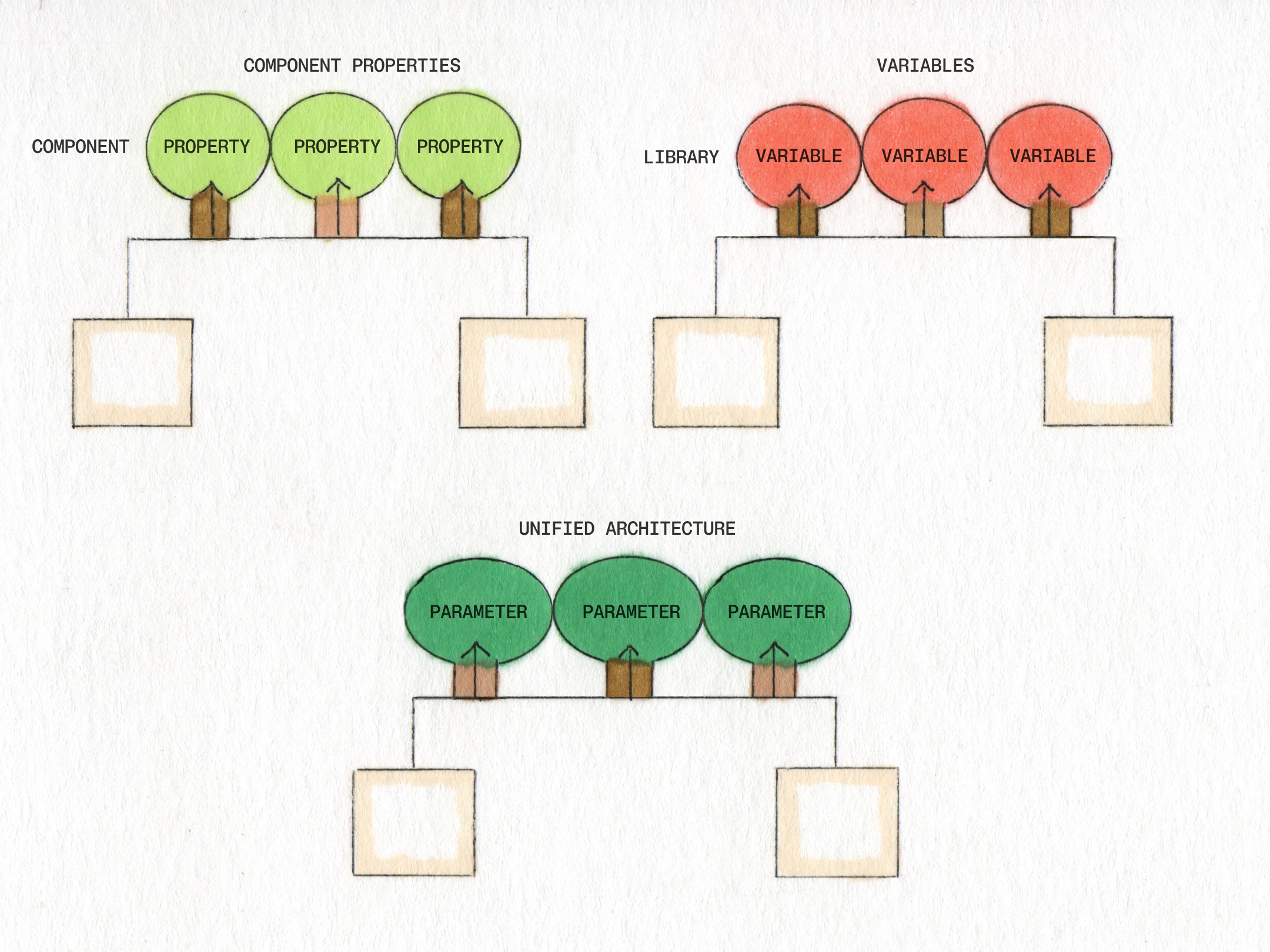
Components are great until you have 200+ of them. Then it becomes a special kind of hell that Dante forgot to include in his Inferno.
Component Properties That Actually Matter:
- Boolean properties for showing/hiding elements (works well)
- Text properties for customizable content (basic but useful)
- Instance swap for switching between variants (when it doesn't break)
What Sounds Good But Sucks:
- Variant combinations - they multiply exponentially and become impossible to manage
- Nested components - performance dies and everything breaks when you update the parent
- Complex property logic - debugging becomes impossible
Real Performance Numbers:
Our design system file became unusable around 150-200 components - clicking anything took forever and scrolling was painful as hell. Variable lookup got so slow I started keeping a separate note with common variable names because searching took longer than just typing from memory.
Complex nested components crash browsers regularly. Large files are basically unusable on older machines. One bloated file took forever to open on an older MacBook, assuming it didn't time out entirely.
How to avoid having an existential crisis:
- Split big component libraries into manageable chunks under 100 each
- Use separate files before everything becomes one giant file that crashes everything
- Don't nest more than 3 levels deep (learned this debugging a nested button that refused to update properly)
- Avoid boolean operations on complex shapes (crashes browsers and makes you question life choices)
File Organization That Works:
Design System/
├── 01-Foundations (colors, spacing, typography)
├── 02-Components-Basic (buttons, inputs, cards)
├── 03-Components-Complex (tables, modals, forms)
├── 04-Patterns (page layouts, common sections)
Real Talk on Design System Governance:
Most teams start with grand plans about governance, then watch their design system turn into a digital wasteland within 6 months. Here's what actually prevents total chaos:
- One person owns the design system (committees don't work)
- Breaking changes require a migration plan (and time to execute it)
- Deprecation warnings before deleting anything (via component descriptions)
- Regular audits to find unused/broken components (quarterly, not daily)