
You know how you spend half your time clicking through your app just to get to that one form that breaks when the user has a really long name? Storybook fixes that shit. It started as a React thing but now works with Vue, Angular, Svelte, and whatever framework you're being forced to use this week.
The Whole Point
The whole point of Storybook is this: build your components by themselves, without all the other crap in your app breaking them or getting in the way. Instead of dealing with login flows, API calls that fail randomly, and state management that makes you question your career choices, you just build the component.
Here's what actually matters:
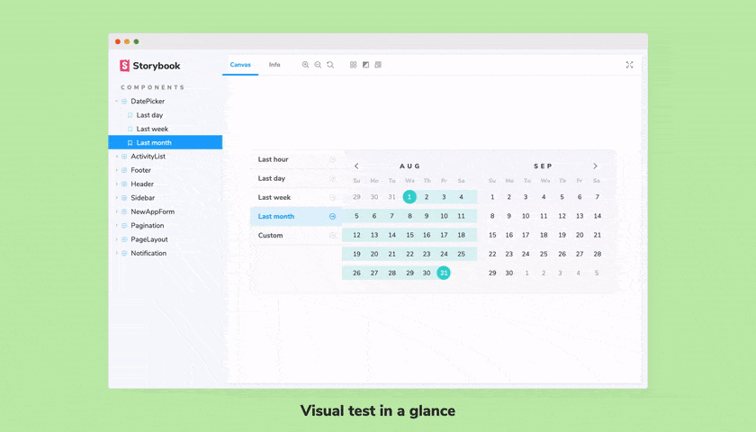
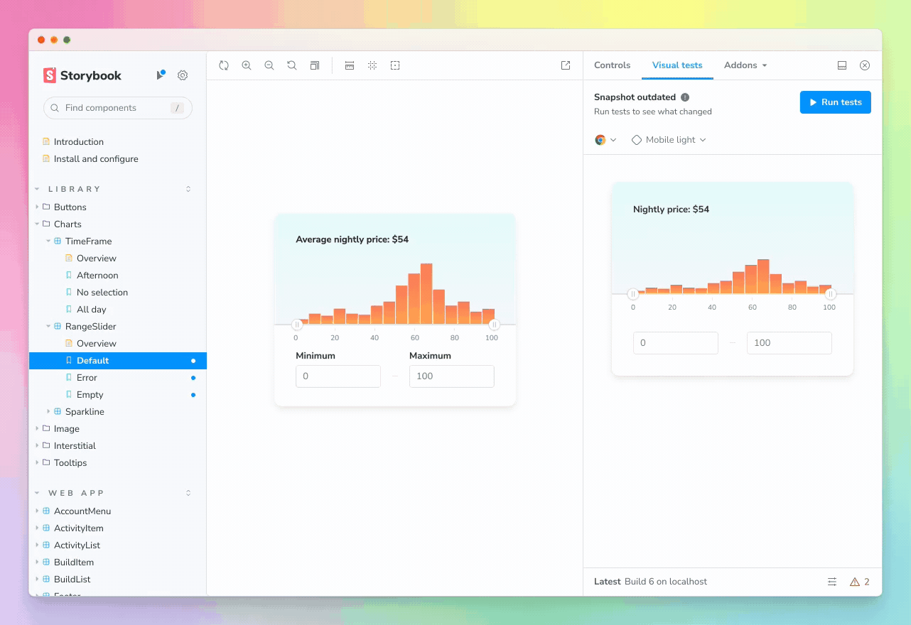
You Can Actually Test Edge Cases: Ever try to test what happens when someone enters a 47-character email address in your production app? Good luck. In Storybook, you just create a story for it and boom, there it is.
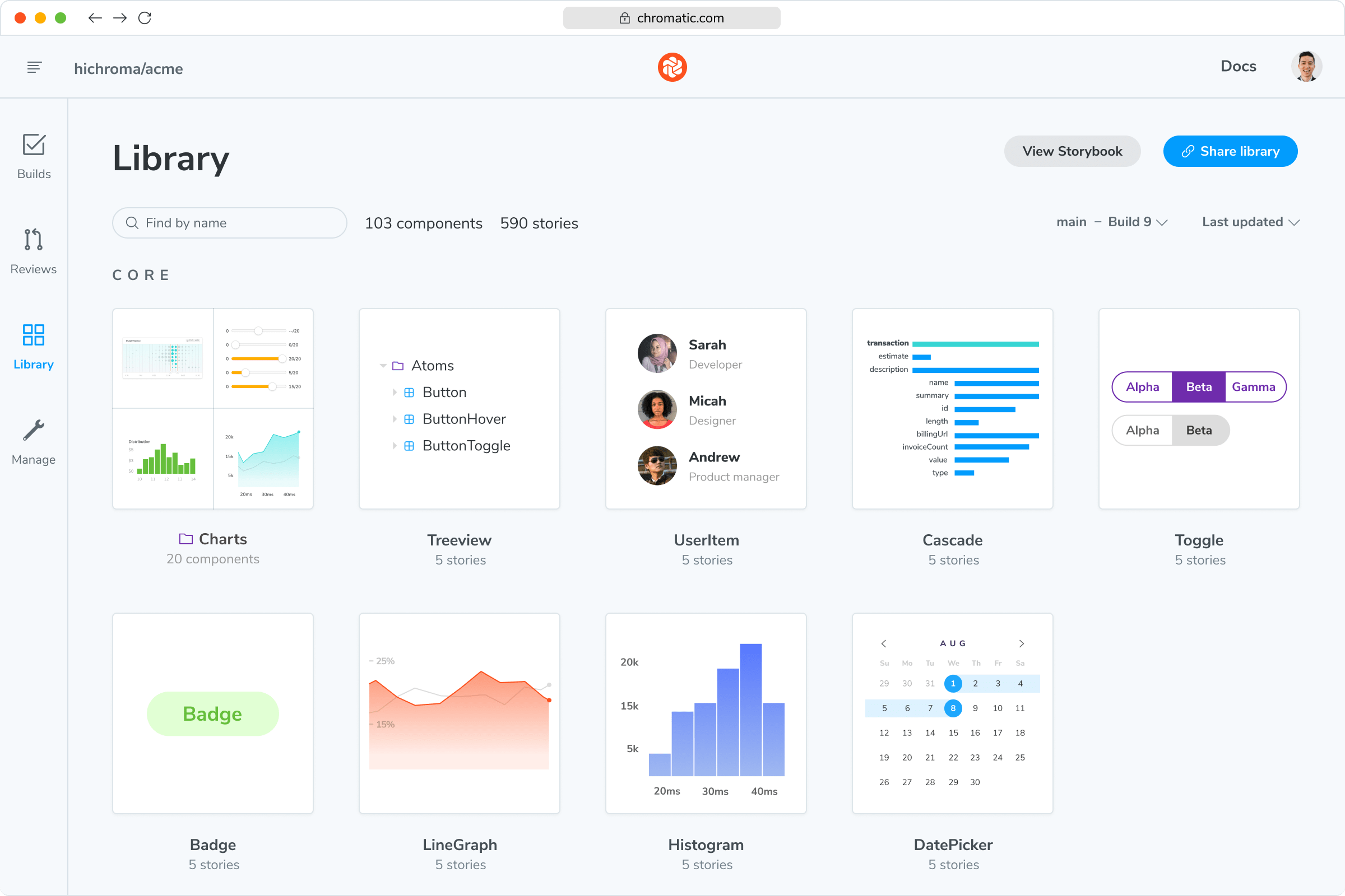
Components Stop Sucking: When you build in isolation, you can't accidentally depend on some global state or prop that only exists in one specific part of your app. Your components actually become reusable instead of tightly coupled garbage. Component composition patterns force you to think about your API design.
Designers Stop Complaining: All your component variations are in one place, so when your designer asks "can we make the button 2px bigger?" you can show them all 47 button variants instead of hunting through the entire app. Tools like Figma's Storybook plugin make the handoff even smoother.
Latest Version and Capabilities
Storybook 9.0 dropped in June 2025 and they've been iterating fast - 9.1 came out in July and we're already seeing 9.2 patches. Here's what actually matters:
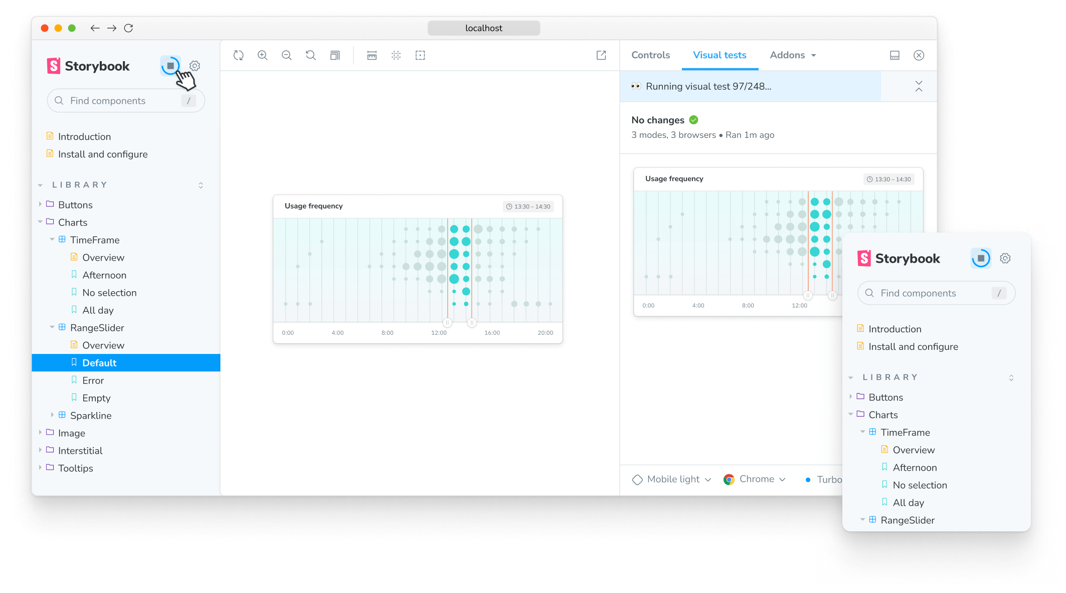
Testing That Doesn't Suck: They partnered with Vitest so now you can run interaction tests, accessibility tests, and visual regression tests without setting up three different tools that all break in different ways. The testing documentation actually makes sense this time. Still took me 3 hours to figure out why my interaction tests kept failing - turns out you can't use window.location in the test context.
Bundle Size Improvements: The install used to take forever and eat your hard drive. Now it's supposedly 48% smaller according to their blog post, which means it only takes half-forever and eats less of your hard drive. Still waiting to see if this holds up in practice.
Auto Story Generation: It can create stories from your component code automatically using the autodocs feature. Still needs tweaking, but beats writing them all by hand.
Tags for Organization: You can tag stories as "broken", "deprecated", or "please-god-someone-fix-this" using the new tagging system so your team can actually find stuff in large codebases.
How This Actually Works
You write "stories" which are just examples of your component in different states. It's basically a function that says "render my button like this":
export default {
  title: 'UI/Button',
  component: Button,
};

export const Primary = {
  args: { variant: 'primary', children: 'Click me' }
};

export const Disabled = {
  args: { variant: 'primary', disabled: true, children: 'Disabled' }
};
Then you can use these same stories for development, testing, documentation, and showing designers why their 15-pixel border radius looks like shit. The Component Story Format is standardized, so your stories work across different tools and versions.
Who Actually Uses This
Big companies use it because someone has to manage all their components:
- Shopify, BBC, Microsoft, and NASA all have public Storybooks
- Tons of GitHub stars (which means nothing but makes management happy)
- Over 36 million monthly downloads, though half of those are probably CI rebuilds
- Used by companies in the Fortune 500 because someone has to justify the engineering budget
The Workflow (When It Works)

You build small things first, then stick them together:
- Build a button by itself (without 17 different context providers that break mysteriously)
- Build a form that uses the button
- Test the button in every possible broken state users will find (and they WILL find them)
- Document why the button works the way it does (so future you doesn't hate current you)
- Show designers the button so they can ask you to change the padding by 1px
This actually works pretty well once you get used to it, assuming your components aren't a tangled mess of global dependencies and circular imports. The atomic design methodology works particularly well with Storybook's approach.
The Addon Ecosystem
There's an addon for everything - over 400 of them. Most are useful, some are abandoned, and a few will break your build. The addon ecosystem guide helps you navigate what's actually maintained:
- Design Tools: Connect to Figma, Zeplin, InVision (when the plugins work)
- Testing: Jest, Playwright, Cypress integration (prepare for config hell)
- Documentation: Auto-generates docs from your TypeScript interfaces (usually)
- Accessibility: Built-in WCAG testing with axe-core that actually catches problems
- Visual Testing: Chromatic integration for catching pixel-level changes