Draw.io (now calling itself Diagrams.net for some domain politics bullshit) is what you use when you need to draw network diagrams at 2am and don't want to pay Lucidchart $100/month. It's free. Actually free - not "free with annoying watermarks" or "free until you hit 5 diagrams." Just free.
The Good Shit
It's completely fucking free. No premium tiers, no "upgrade to export PNG" nonsense, no monthly subscription reminders. You can create unlimited diagrams with every feature unlocked. I've been using it for 3 years without paying a dime, and it's never asked me for money. This alone makes it worth trying.
Your data stays yours. Everything runs in your browser - Draw.io's servers never see your diagrams. When you save to Google Drive or OneDrive, the file goes straight from your browser to your storage, not through their servers. If you're paranoid about data privacy (you should be), this is huge.
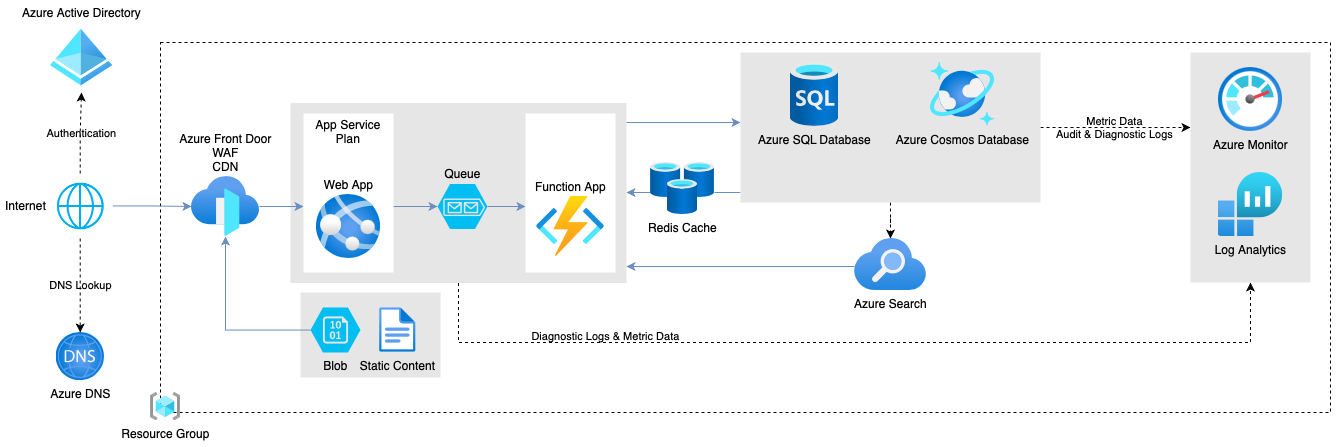
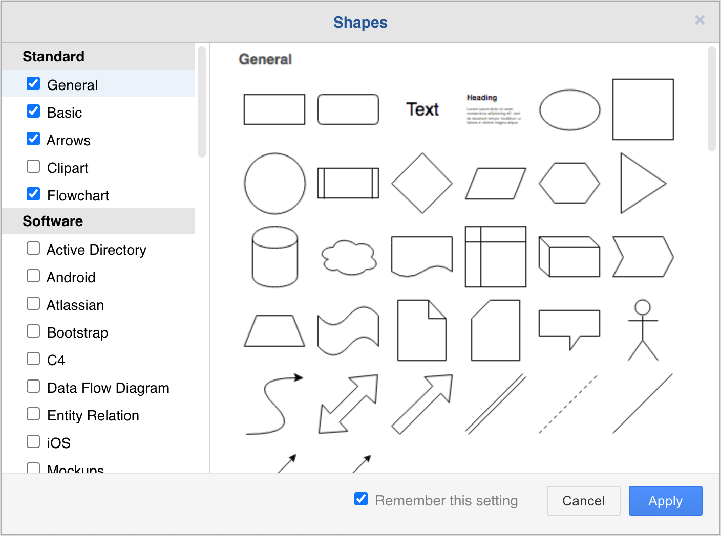
AWS icons that don't suck. They actually keep the AWS/Azure/GCP icon libraries updated. When AWS releases new services, the icons show up in Draw.io pretty quickly. Better than paying $200/year for stale Visio templates. The official AWS architecture icons are integrated and maintained.
Works in every browser. Chrome, Firefox, Safari, Edge - it works everywhere. No "this only works in IE11" bullshit. I've used it on Linux, Mac, Windows, even my phone when desperate (though mobile editing is pure torture - don't do this to yourself).
The Real Problems Nobody Talks About
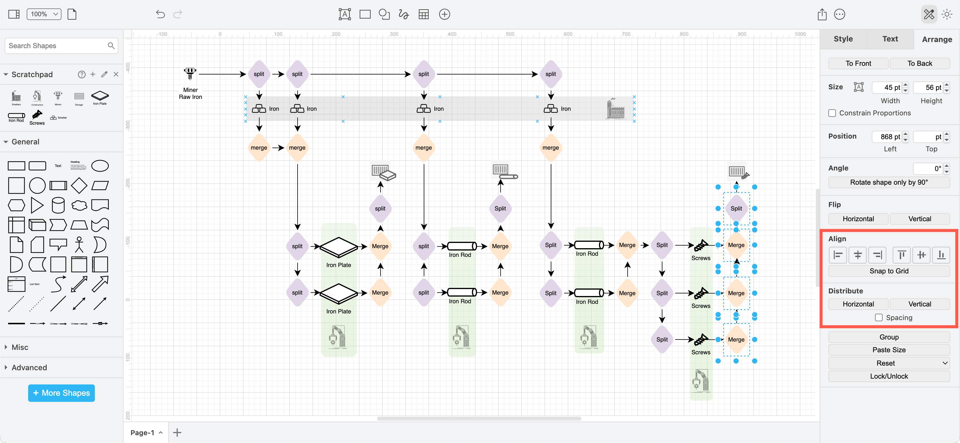
Performance turns to shit with big diagrams. Try making an AWS architecture diagram with 200+ services and watch your browser have a mental breakdown. I learned this the hard way documenting a microservices architecture - took forever just to move an icon. Had to split it into multiple diagrams just to keep my sanity. The performance limitations are well documented by other users who've hit the same wall.
Collaboration got better recently but still has limits. They finally added real-time collaboration - you can see teammates' cursors moving around when editing shared files, which is way less jarring than shapes randomly appearing. But it only works with cloud storage - no direct collaboration in the web app. Still feels like a band-aid on a fundamental limitation.
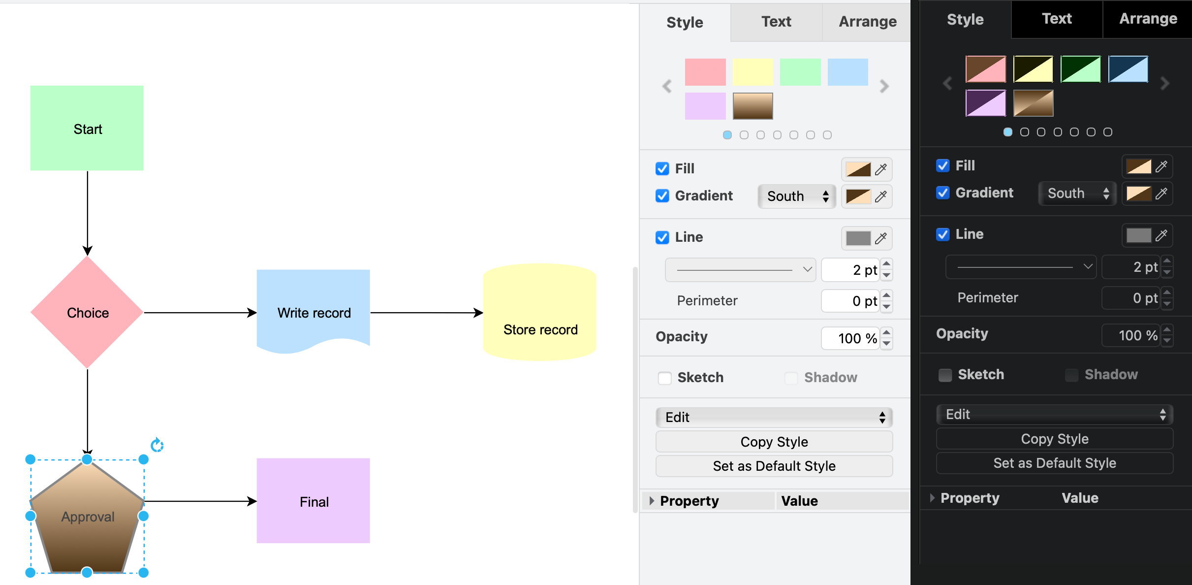
The UI looks like Microsoft Office 2003. It works, but damn it's ugly. Compared to modern tools like Miro or Figma, it feels like using a flip phone. All the buttons are there, but the experience is clunky as hell. They've promised UI updates but it's still pretty dated.
My Real Usage After 3 Years
I use it for AWS architecture diagrams, network topologies, and any technical documentation where I need precision. It's my go-to for:
- System design docs - The shapes are accurate and professional, especially with example templates
- Network diagrams - Better than Visio for networking gear, see network diagram tutorials
- Process flows - When I need something that doesn't look like a 5-year-old drew it
I DON'T use it for:
- Collaborative workshops - Use Miro instead
- Quick sketches - Too slow for brainstorming
- Presentations - Export to PowerPoint, don't present directly
The Verdict After 36 Months
It's a solid tool if you need professional diagrams and don't want to pay monthly fees. The privacy angle is real - your corporate secrets don't live on some random SaaS server. But the collaboration sucks, performance hits walls, and the UI needs a 2025 makeover.
For solo technical documentation work, it's fantastic. For team collaboration, you'll want something else. But for free? It punches way above its weight class.
Worth trying if you're currently paying for diagramming tools and questioning your life choices. Check out the official documentation and step-by-step guides to get started, or dive into the GitHub repo if you want to self-host.